
Magazine Layout Designs, Context,Research and Process Unit 1-4 Blog.
- 30090865
- Dec 9, 2020
- 3 min read
Updated: Jan 14, 2021
Research:


One of the histories I've picked is the berlin wall as part of my magazine design. Reason being is i was fascinated by how the history of the wall started and how it changed throughout the years.
Tobey's lesson i started to learn about InDesign, in InDesign i was taught how to create magazine layouts such as the front part of the magazine and the inside part where all of my context and research would be included.
First I've started off with my process in the sketchbook with adding context onto what the double spread would include and how the design process would then start to change. in adobe InDesign, i started to create my double page spread digitally just the way i made it in the sketchbook by starting from scratch by adding text "Lorem Ipsum" which is just random text generated. and then with that text i started to look at if the way when adding the text i need for the berlin wall would make sense to put it in that style of double spread page.

I did the same with the front cover of the magazine layout where i start my first process and design of what i imagine it to look like at first and then slowly start changing through different designs and eventually create the digital version of it so that it comes close to becoming the final design.

After Looking at the first process and design i did in my sketchbook, i decided to carry on my different process's in Adobe Illustrator. i started to come up with different designs to do with the magazine Layout starting with the double spread sheet. Originally also , my plan was to start designing in InDesign with skills i learnt from Tobey's lesson after coming up with ideas in Illustrator for the front page and the double spreadsheet. until i started to struggle with the application so i decided then adobe Illustrator was the one i would start designing in.

I started going through different designs with the double page spread and exploring the different ways i could add my titles, sub text, images and text to do with articles. instead of just going for one concept, i wanted to explore and figure out what other ways my double page spread would look like ands how the design would look like..
i then started to come up with ideas to do with the front cover and how that would look like. the ideas i came up with were to add images as the front cover for the berlin wall so that it would show in front that the magazine is about the berlin wall, how it started and ended throughout the years. when designing the front cover, just like for the double page spread, i thought carefully about my different designs and see which one would be suitable and what would work out, an example of the designs i did were here:

Though it was my first two designs/concept for the front cover, i also did some other designs and made sure they weren't the only ones i would have used as a final design etc. i then started to go onto finally designing my front page and double spread page.
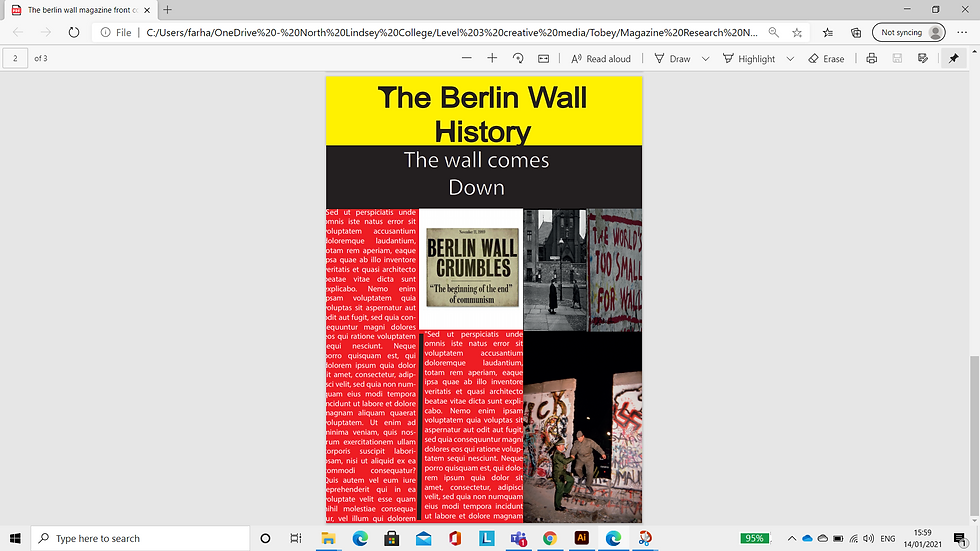
This was my final design for my front cover of the berlin magazine. i wanted to do it like this because since the berlin wall was about getting freedom, i put the word "wall" at the side to suggest that it was put at the side and not being able to get destroyed or moved. the use of colour was red for the background and black for the letters which was implying the german flag except for yellow

for the double spread pages, i carried on with the colour scheme of the German flag in the background and used banners as well for title, sub title and generated text to do with the magazine.


Comments